Dropdown
A dropdown allows users to select one option from a list.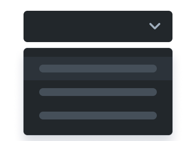
Without overflowing the screen with alot of options.
Default Value
Do null for the placeholder in the slot or do an value(In the consuming variable) for an default selection.
for example: let choice = 'A'
for example: let choice = 'A'
Binding Method
Uses on:bind to bind the value of the dropdown to an variable.This is recommended if you have multiple inputs that need to be collected from the user at once.
Selected: null
<script lang="ts">
	import { Dropdown } from "@davidnet/svelte-ui";

	// Do null for the placeholder in the <slot> or do an value for an default selection.
	let choice: string | null = null;
</script>

<Dropdown
	actions={[
		{ label: "Choice A", value: "A" },
		{ label: "Choice B", value: "B" },
		{ label: "Choice C", value: "C" }
	]}
	bind:value={choice}
	appearance="primary"
>
	Make an choice!
</Dropdown>

<p>Selected: {choice}</p>
Function Listen Method
Calls the provided function onchange. This is recommended if you need directly handle the value change in a function.Selected: null
<script lang="ts">
	import { Dropdown } from "@davidnet/svelte-ui";

	// You cannot select an default value.
	let choice: null | string = null;

	const actions = [
		{ label: "Option A", value: "A" },
		{ label: "Option B", value: "B" },
		{ label: "Option C", value: "C" }
	];

	function handleAction(value: string) {
		choice = value;
	}

	const customActions = actions.map((action) => ({
		...action,
		onClick: () => handleAction(action.value)
	}));
</script>

<p>Selected: {choice}</p>

<Dropdown value={null} actions={customActions} appearance="primary" />
Placeholder
Here we did not provide any slot. So the placeholder will fallback to "Menu".
Always Show Slot
The alwaysshowslot prop will show the slot inside the dropdown even if an value is selected.<script lang="ts">
import { Dropdown } from "@davidnet/svelte-ui";
</script>
<Dropdown
appearance="primary"
actions={[
{ label: "dark", value: "dark" },
{ label: "light", value: "light" }
]}
alwaysshowslot>Theme</Dropdown
>
Icon Before
You can also add an icon before the dropdown's placeholder.<script lang="ts">
import { Dropdown, TextField } from "@davidnet/svelte-ui";
let iconbefore: string = "format_paint";
</script>
<Dropdown
appearance="primary"
{iconbefore}
actions={[
{ label: "dark", value: "dark" },
{ label: "light", value: "light" }
]}
>
Theme
</Dropdown>
<TextField type="text" placeholder="Valid icon." bind:value={iconbefore} />
Appearances
import { Dropdown } from "@davidnet/svelte-ui"

<Dropdown  appearance="primary" actions={[ { label: "Option A", value: "A" }, { label: "Option B", value: "B" } ]}">primary</Dropdown>